Thorough User Research
Conducted in-depth research on Tonic's target user base to understand their needs, preferences, and expectations before initiating any design decisions.

Tonic's existing app lacked a modern visual design, failing to reflect the innovative and forward-thinking nature of their healthcare solutions.
The app's design did not effectively highlight or communicate Tonic's core efforts and commitment to delivering on-hand healthcare services to users.
The absence of a contemporary interface made it harder for users to engage comfortably with the app, reducing overall usability and satisfaction.
The existing appearance failed to align with Tonic's brand vision, creating a disconnect between the quality of their healthcare solutions and how they were visually presented.
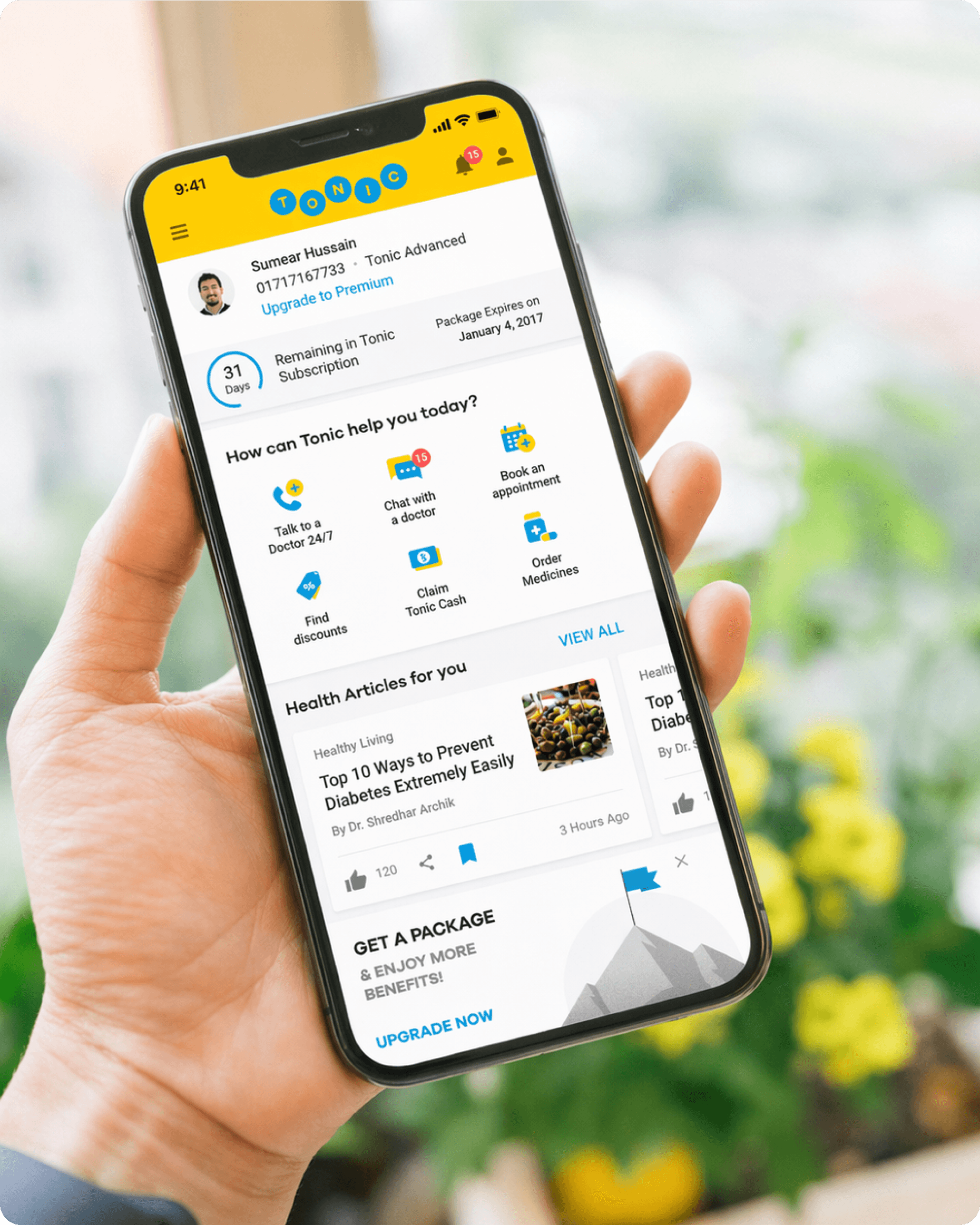
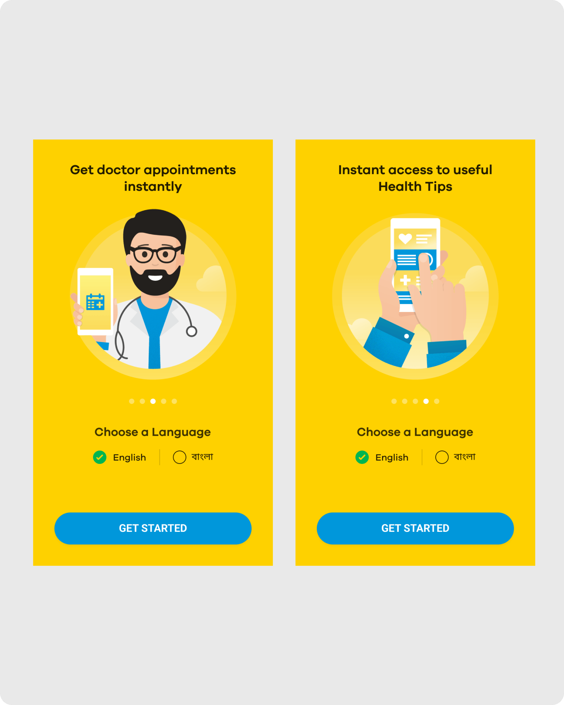
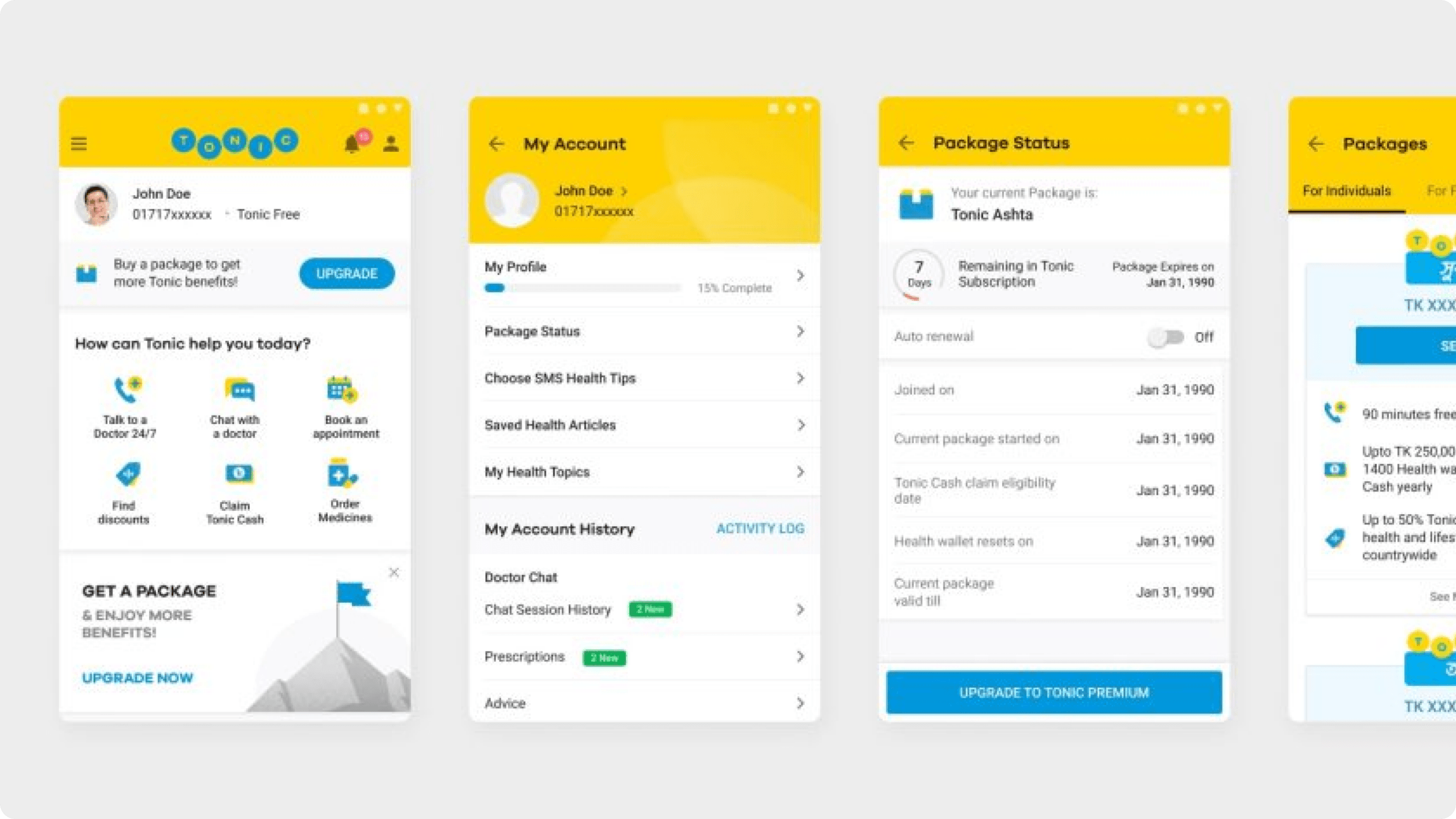
Conducted in-depth research on Tonic's target user base to understand their needs, preferences, and expectations before initiating any design decisions.

Translated research findings into a clear design strategy, ensuring every visual and interactive element was purposefully aligned with user behavior and expectations.

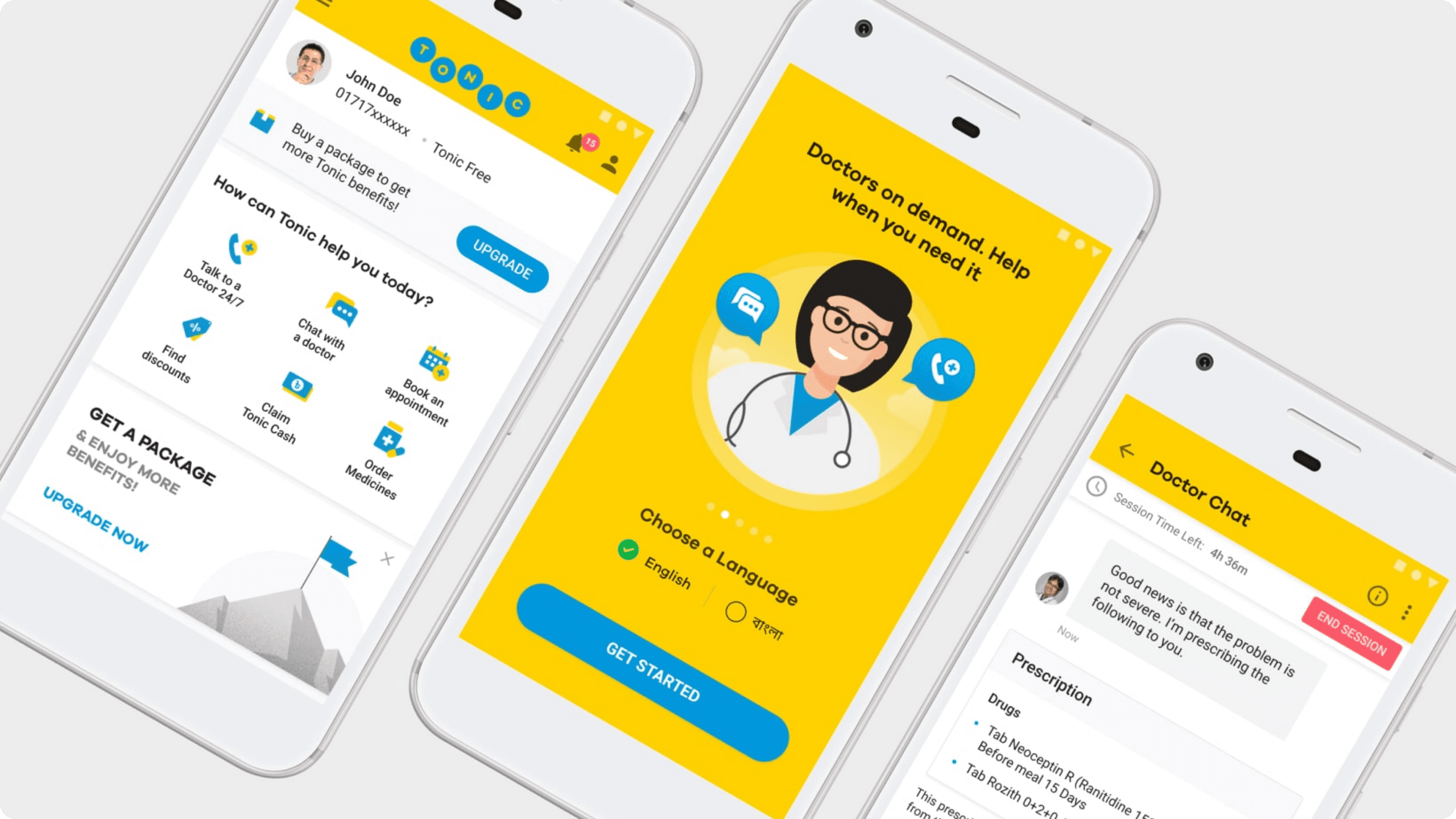
Carefully selected and integrated relevant, healthcare-specific icons that intuitively guided users through the app while reinforcing Tonic's core service offerings.

Incorporated meaningful and contextually appropriate imagery that resonated with the target audience and strengthened the overall visual storytelling of the app.

Designed a highly interactive app experience with engaging UI elements that encouraged user participation and made navigating healthcare solutions effortless and enjoyable.
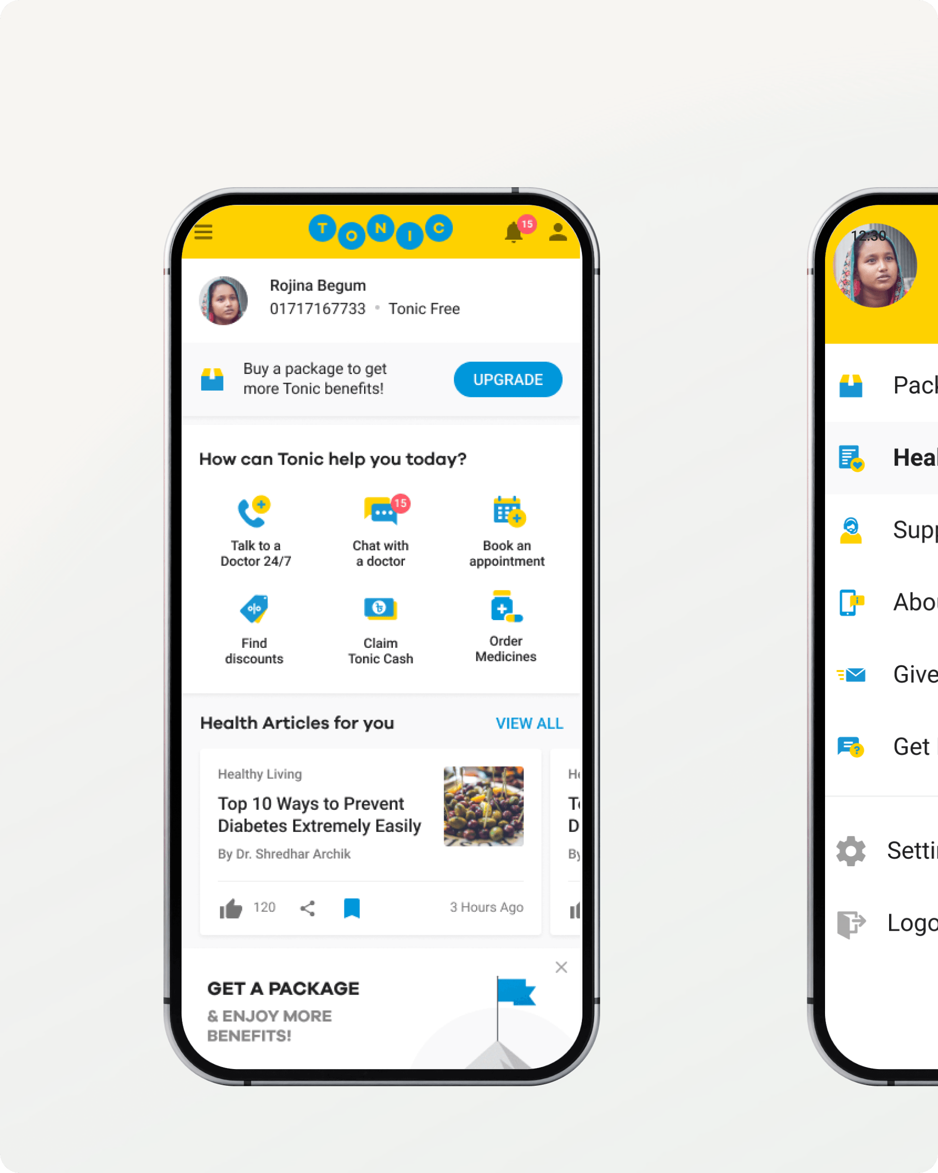
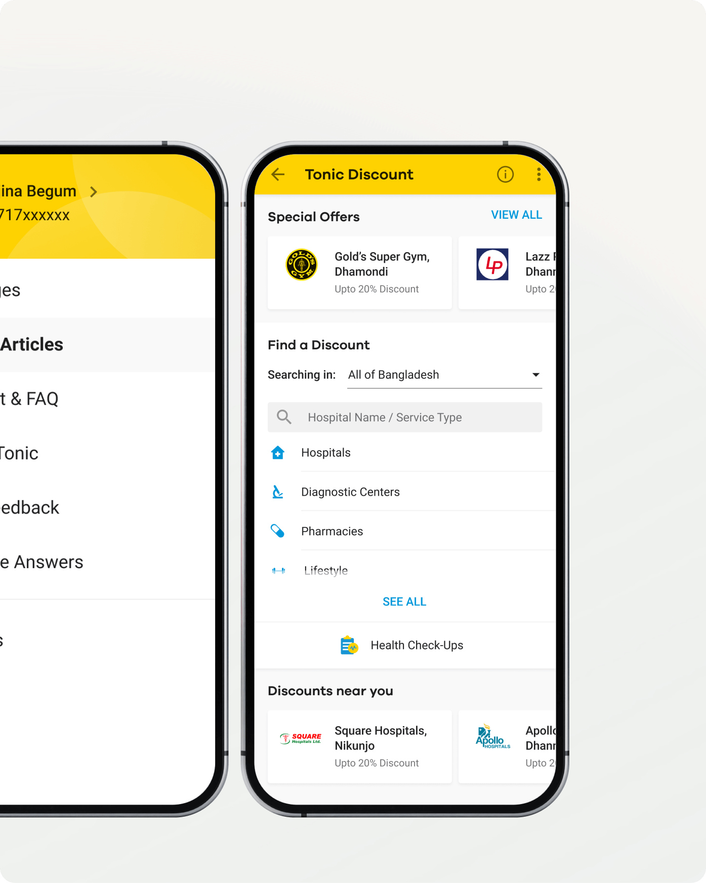
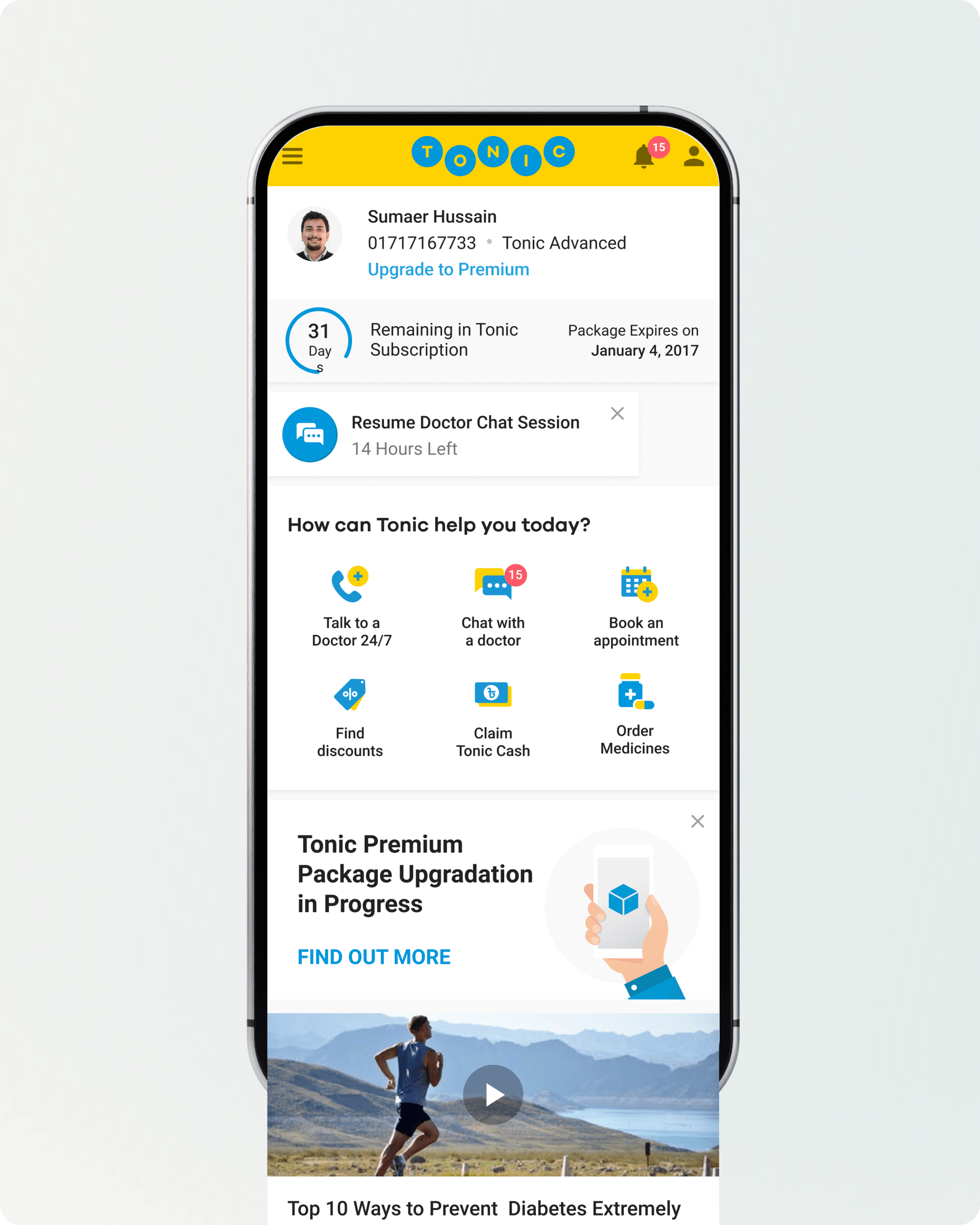
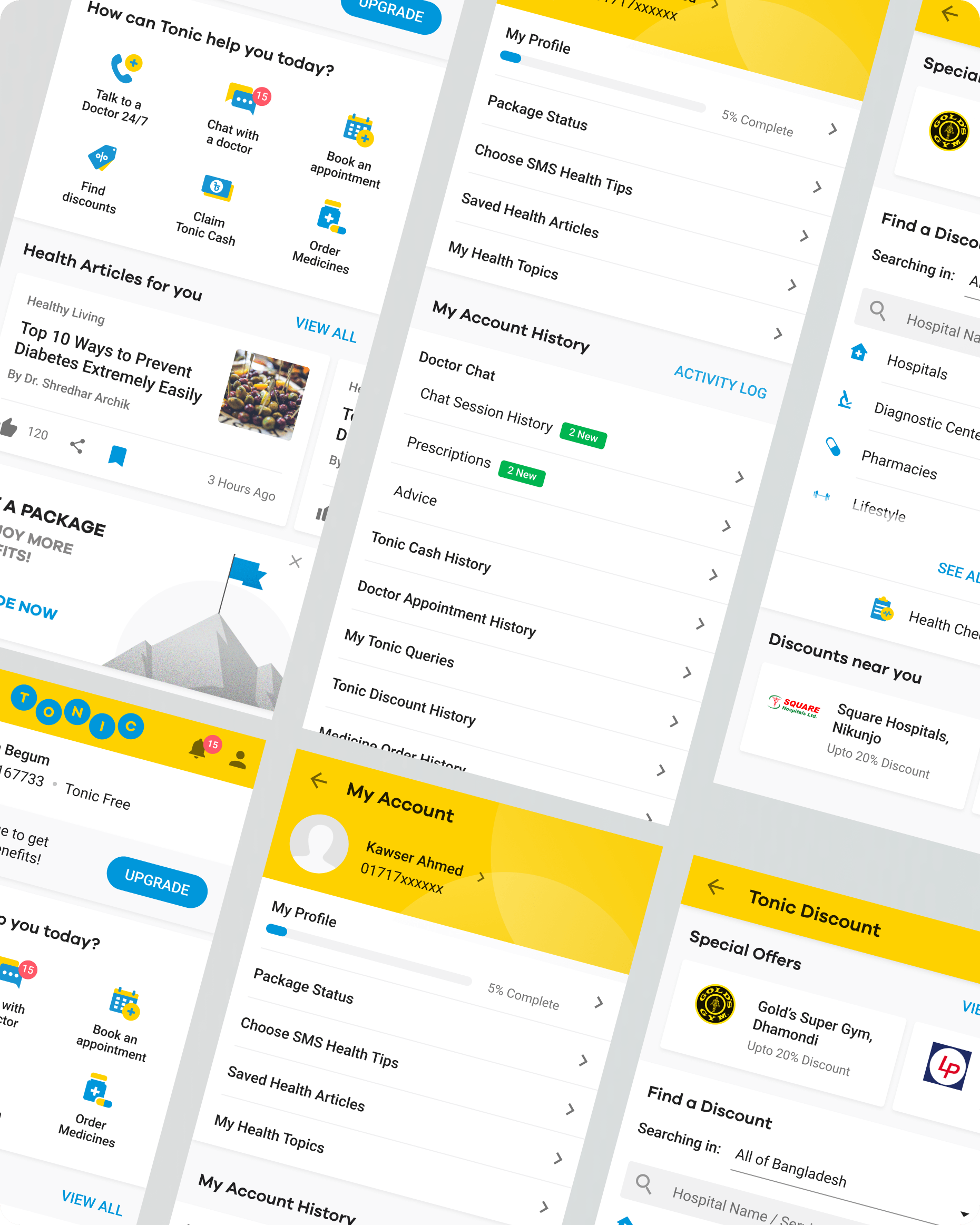
The research-backed redesign gave Tonic a fresh, contemporary look that accurately reflects the innovation and quality behind their healthcare solutions.
Thoughtfully implemented icons and imagery created a visually stimulating experience, encouraging users to explore and interact more deeply with the app.
The new design effectively emphasized Tonic's commitment to on-hand healthcare, creating a stronger and more consistent connection between the brand and its users.
A highly interactive interface made the app significantly easier and more enjoyable to use, improving overall satisfaction and long-term user retention.

You’ve scrolled this far, so we clearly have your attention. Now, let’s help you grab your customers' attention with something they can't ignore.
Or directly connect with us