
What is Conversion Rate Optimization (CRO)?
Imagine you're running a store that gets thousands of walk-in customers every day, but only a few end up buying something. Now, instead of trying to bring in more people, what if you could simply convert more of the ones who are already there? That, in essence, is what Conversion Rate Optimization (CRO) does for your website.
CRO is the systematic process of increasing the percentage of website visitors who take a desired action—whether that’s making a purchase, subscribing to a newsletter, booking a call, or even downloading a lead magnet. Instead of throwing money at ad platforms and waiting for a miracle, CRO helps you squeeze every bit of value out of your existing traffic.
Let’s say you get 10,000 visitors a month, and only 2% convert—that’s 200 conversions. But if you improve that to just 4%, you’ve doubled your results without spending an extra dime on traffic. That’s the magic of CRO.
And it’s not just about tactics like changing button colors or tweaking headlines. Real CRO is rooted in understanding your users—what they want, what’s stopping them, and how you can make it ridiculously easy for them to say “yes” to your offer.
The 2025 CRO Edge: Why It's Non-Negotiable Now
It’s 2025, and if you’re still treating CRO as a “nice-to-have,” you’re already behind. The digital landscape has changed drastically:
- Customer acquisition costs are through the roof.
- Paid ad targeting is less accurate thanks to privacy updates.
- Competition online is fiercer than ever.
- Consumers are more skeptical and distracted than they've ever been.
Relying solely on traffic to drive revenue is like filling a leaky bucket. You need to fix the holes before pouring in more water. CRO is the patch—and sometimes the upgrade—that transforms your website from a static billboard into a 24/7 sales machine.
According to the latest insights from our CRO Guide, High-performing businesses are treating CRO not as a side hustle but as a core growth approach best supported by robust digital marketing services.
That’s why we’ve created a powerful, easy-to-follow document packed with real-world examples, checklists, and frameworks to help you get serious results fast.
Download Our Free CRO Guide for Actionable Strategies
Ready to stop guessing and start converting? We’ve prepared a detailed Conversion Rate Optimization (CRO) Guide that walks you through the exact steps high-growth companies use to turn browsers into buyers. This guide includes:
- A complete CRO foundation blueprint
- Real examples from brands like Dropbox and Edible Arrangements
- Psychological tactics that drive user action
- Testing and experimentation frameworks
The Core Pillars of a High-Impact CRO Strategy
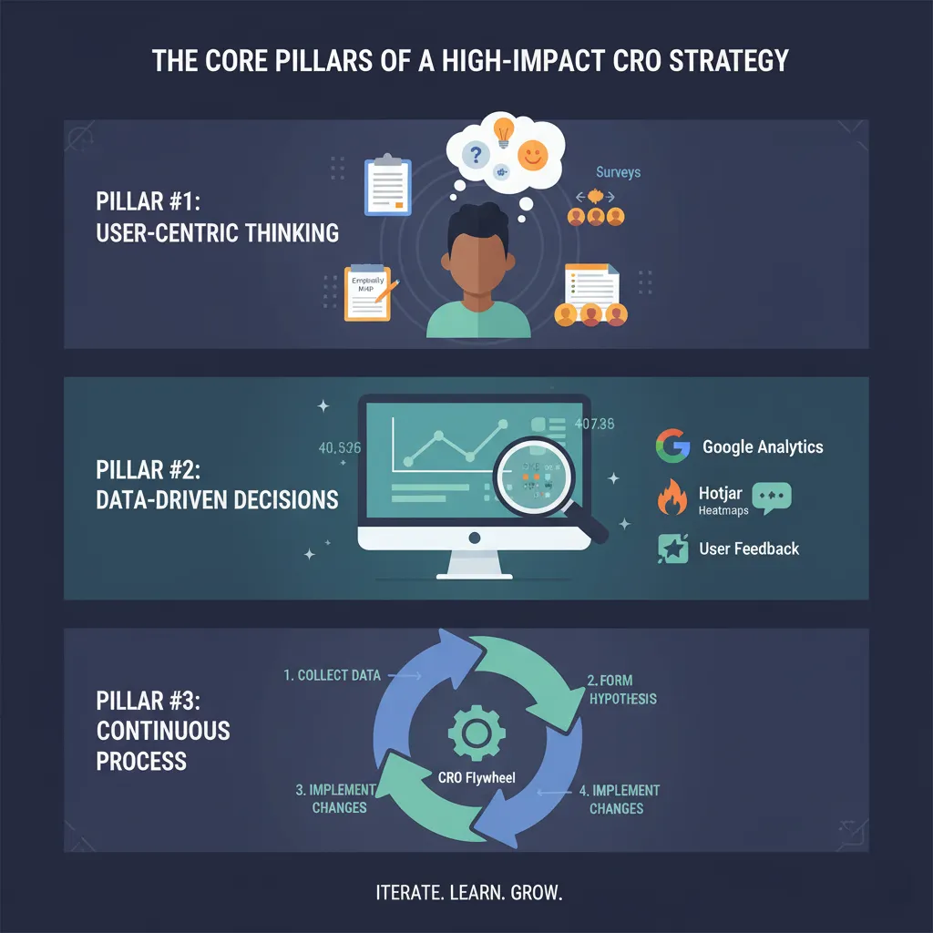
Pillar #1: User-Centric Thinking
At the heart of CRO is empathy. If you don’t understand your users—their needs, motivations, fears, and frustrations—you’re not optimizing; you’re just guessing. CRO begins with a simple but powerful shift in mindset: stop designing for you, start designing for them.
Think of your website like a guided tour. Is the path clear? Are the signs helpful? Does the experience match what your visitors expect?
Here’s what user-centric CRO looks like:
- Deep audience research: Surveys, interviews, and session recordings to understand intent and friction points.
- Persona development: Creating real-world avatars of your buyers to guide content and layout.
- Empathy maps: Visualizing what your users think, feel, say, and do when interacting with your site.
This principle helps you avoid classic mistakes like cluttered designs, complex forms, or jargon-heavy copy that might make sense to you—but confuse your users.
Bottom line: when you build around your users, conversions happen almost naturally.
Pillar #2: Data-Driven Decisions
Gut feelings have their place in business—but not in CRO. Every decision, from the headline on your homepage to the layout of your checkout form, should be backed by real data.
This doesn’t mean you need a degree in statistics. It means using simple tools like:
- Google Analytics 4 to find where users drop off
- Hotjar for heatmaps and session recordings
- Surveys and polls for user feedback
And then acting on that data with confidence.
What works for one site might tank another. The only way to know is to test, measure, and iterate. And the more you embrace data, the faster you’ll spot opportunities for improvement.
Pillar #3: CRO is a Continuous Process
This isn’t a one-and-done thing. Think of CRO as an ongoing relationship with your website and your audience. Trends evolve. Competitors catch up. What worked yesterday might underperform tomorrow.
Smart brands bake CRO into their culture. They test weekly. They learn from every user interaction. They don’t chase hacks—they build systems.
To win in 2025 and beyond, you must treat CRO like brushing your teeth. Routine. Necessary. Non-negotiable.
Foundations Before Fixes
Define Macro and Micro Conversions
Before you run your first test, tweak a CTA, or redesign a form, pause and ask: what are we optimizing for? CRO without clear goals is like navigating without a map.
Macro conversions are the primary business goals. Think purchases, demo bookings, trial signups, or contact form submissions. These are the big wins that drive revenue and growth.
Micro conversions, on the other hand, are the smaller, supporting steps that lead people toward those macro goals. Things like:
- Watching a video
- Signing up for a newsletter
- Clicking “learn more”
- Adding a product to the cart
Tracking both types is essential. Why? Because micro conversions offer early signals of friction. If people are adding to cart but not buying, you have a checkout issue. If they never add to cart, your product or landing page messaging may be weak.
Use tools like Google Analytics, Mixpanel, or Amplitude to set up conversion tracking. Define every key action on your site—no matter how small—so you can map how users flow through your funnel.
When you have clarity on your conversions, you’ll make smarter decisions faster. You’ll also uncover which levers move the needle most.
Set SMART Goals for CRO
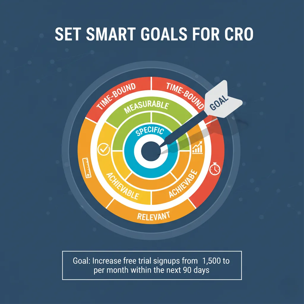
Every optimization effort should ladder up to a clear goal—and not a vague one like “improve conversions.” You need SMART goals:
- Specific: What exactly do you want to achieve?
- Measurable: Can you track it numerically?
- Achievable: Is it realistic based on your traffic and resources?
- Relevant: Does it support broader business objectives?
- Time-bound: What’s the deadline?
Here’s a weak goal:
“Improve trial signups.”
Here’s a strong SMART goal:
“Increase free trial signups from 1,000 to 1,500 per month within the next 90 days.”
By grounding your strategy in SMART goals, you give your team a clear finish line and the ability to measure progress objectively. This eliminates guesswork and helps you stay focused, even when dozens of optimization ideas are flying around.
SMART goals also make testing more strategic. You know why you’re testing something and what outcome you expect. That clarity creates momentum.
Benchmarking and Mapping the Customer Journey
Would you start improving a car without knowing if it’s even broken? Of course not. That’s why benchmarking your current performance is a CRO essential.
Use data to establish a baseline:
- Conversion rate
- Bounce and exit rates
- Funnel drop-off points
- Desktop vs. mobile performance
This snapshot gives you a before/after view once you begin optimization.
But don’t stop there.
You also need to map your customer journey—from awareness to decision:
- Awareness: How do people first discover your brand?
- Consideration: What pages do they view as they learn more?
- Decision: What’s the final step before conversion?
Visualize this journey. Identify where users fall off. Are they bouncing at the pricing page? Hesitating at the checkout? Abandoning the contact form?
Tools like Hotjar, Microsoft Clarity, and user session recordings are goldmines here. They show you the real journey, not the one you think they take.
And remember: CRO doesn’t fix everything at once. It fixes what matters most first. That’s why understanding the customer journey is so critical—it tells you where the problem starts and what’s costing you the most money.
User Experience & Design That Converts
First Impressions, Visual Hierarchy, and Simplicity
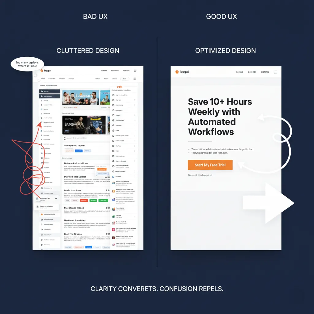
You have less than 7 seconds to make an impression. If your homepage is cluttered, slow, or confusing—people bounce. Simple as that.
Great design isn’t about being flashy — it’s about guiding attention. That’s where visual hierarchy comes in. Your most important message should be the first thing they see. Your CTA should pop without feeling pushy. Your layout should lead the eye, not fight it.
That's why smart marketers complement CRO with UI/UX design services that convert.
Here’s how to nail it:
- Place your value proposition above the fold (no scrolling required).
- Use contrasting colors to make CTAs stand out.
- Limit distractions. Too many offers or menus = decision fatigue.
- Keep whitespace. It makes content digestible and professional.
Look at Dropbox’s homepage redesign. They stripped out clutter, highlighted just one action (sign up), and increased signups across the board. That’s the power of design with a purpose.
And don’t forget the “gut test.” Open your site and ask: would someone know exactly what I offer in 5 seconds? If not, it’s time to optimize.
Mobile Optimization is Non-Negotiable
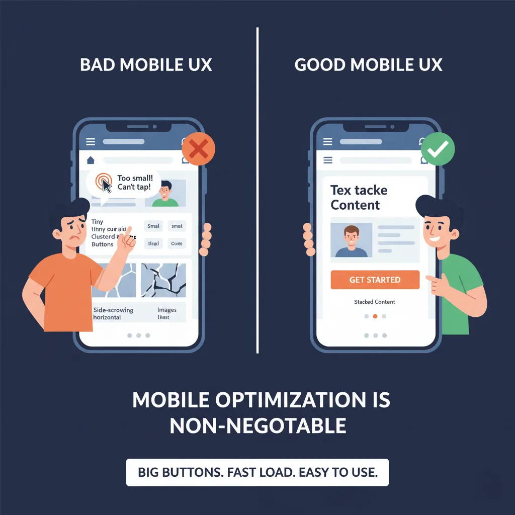
More than half of your visitors are on their phones. Yet many sites still look—and behave—like they were built for desktops in 2012.
If users have to pinch, zoom, scroll sideways, or tap tiny buttons, they’ll leave. Fast.
Your CRO wins will vanish if your mobile experience sucks.
Here’s what mobile-first design looks like:
- Big, tappable CTAs
- Sticky headers and navigation for easy access
- Shorter forms with autofill enabled
- Content stacked vertically—not squished side by side
Run your site through Google’s Mobile-Friendly Test. Watch actual mobile user sessions with Hotjar. And always preview landing pages on multiple screen sizes before publishing.
Mobile isn’t optional anymore—it’s your primary battleground. Treat it that way.
Accessibility and Trust Elements
Accessibility is more than a checkbox—it’s a conversion strategy. When your site works for everyone, you earn more trust, reduce bounce rates, and open the door to new audiences, including those with disabilities or impairments.
Start with accessibility essentials:
- Use readable font sizes (16px minimum) and avoid overly decorative fonts.
- Ensure high color contrast between text and background.
- Add alt text for every image—this helps with both accessibility and SEO.
- Make your site keyboard-navigable for users who can’t use a mouse.
- Use clear labels on all forms and buttons.
Beyond accessibility, trust-building elements are CRO gold. If people don’t feel safe, they won’t convert—period. This is especially true for first-time visitors and high-ticket purchases.
Place these trust signals near your CTAs:
- Customer testimonials and reviews
- Security badges (SSL icons, payment trust symbols)
- Guarantees and refund policies
- Third-party endorsements or media mentions
- Visible contact information
You’re not just asking people to click—you’re asking them to trust you. Don’t make them guess if it’s safe to take the next step.
Even subtle design changes—like using friendly microcopy around forms (“We’ll never spam you”)—can reduce friction and increase trust.
Great CRO starts by making your visitors feel seen, understood, and protected. Accessibility and trust do exactly that.
Data, Research & Prioritization in CRO
Quantitative Data: The What
To improve conversions, you need to know where things are breaking down. That’s what quantitative data gives you—the what behind user behavior.
Use platforms like:
- Google Analytics 4 (GA4)
- Mixpanel
- Amplitude
These tools show hard numbers:
- Where people land
- Where they leave
- How long they stay
- What they click
- Where they abandon the funnel
Key metrics to monitor:
- Conversion Rate (CR): The percentage of visitors who complete a desired action.
- Bounce Rate: High bounce? The page likely doesn’t match intent.
- Exit Rate: Reveals friction points (e.g., people exiting during checkout).
- Cart/Form Abandonment: Tells you where people hesitate most.
- Session Duration: Short sessions often mean poor engagement.
- CTR on CTAs: Low CTR? Your message or placement may be weak.
This data shows you where to look—but not why things happen. For that, we turn to…
Qualitative Data: The Why
Numbers tell part of the story. To truly understand your users, you need qualitative insights—the emotions, thoughts, and frustrations behind their actions.
Here’s how to get them:
- Heatmaps (from Hotjar, Crazy Egg): See where users scroll, click, or ignore.
- Session recordings: Watch real users navigate your site. Spot rage clicks, hesitation, and confusion.
- On-site surveys: Ask direct questions like “What’s stopping you from signing up?”
- Live chat transcripts: Real-time objections, questions, and concerns.
- User interviews and usability testing: Dig deep into motivations and blockers.
Qualitative data bridges the gap between behavior and intent. It tells you why your beautifully designed landing page might still fail.
Example: Your analytics show a 60% drop-off at checkout (quantitative). Recordings reveal users get confused by mandatory account creation (qualitative). That insight tells you what to fix: enable guest checkout.
Using a Prioritization Framework
Once you gather all that data, you’ll likely end up with a laundry list of things to fix. But here’s the secret: you can’t fix everything at once.
Enter the PIE framework—a simple way to prioritize based on:
- Potential: How much could this change improve conversions?
- Importance: How critical is this page or step to your funnel?
- Ease: How simple is the fix to implement?
You want to start with high-potential, high-importance, and easy-to-execute items. Example: removing two fields from a long signup form is easier and more impactful than a complete homepage redesign.
Another option is the ICE framework (Impact, Confidence, Effort).
These frameworks prevent decision paralysis. They give your team a roadmap so you're not just reacting to every heatmap or user comment. You’re working from a plan—and that’s how CRO becomes a growth engine.
Psychology & Persuasion: Human Behavior Hacks

Social Proof and Trust Signals
We’re social creatures. When we see others using and loving a product, we’re more likely to trust it ourselves. That’s why social proof is a core psychological driver in CRO.
Examples of effective social proof:
- Testimonials with photos and names
- Star ratings and reviews from verified buyers
- Customer logos (“Trusted by 5,000+ companies”)
- Case studies showing measurable results
- User-generated content (photos, videos, posts)
Social proof creates what psychologists call “herd behavior.” If others have done it—and had a good experience—it must be safe for me too.
Place social proof:
- Near CTAs
- On pricing pages
- Next to product/service benefits
Combine that with trust signals like:
- “Money-back guarantees”
- “Secure checkout” icons
- “No credit card required” notes
Together, they reduce friction, eliminate doubt, and nudge users toward action.
Want an instant win? Add a few trust indicators near your CTA and watch engagement improve.
Scarcity, Urgency, and Clear Value Proposition
We humans are funny—we hate missing out more than we love gaining something. That’s why scarcity and urgency are such powerful psychological levers in CRO.
When used ethically, these tactics can significantly boost conversions.
Here’s how to create urgency:
- Countdown timers (“Offer ends in 3h 14m”)
- Time-limited discounts (“Only today: 25% off”)
- Urgent CTA text (“Reserve my seat now” instead of “Submit”)
And here’s how to use scarcity:
- Limited availability notices (“Only 2 left in stock”)
- Popularity badges (“Bestseller”, “Hot item”)
- Real-time activity alerts (“14 people just bought this”)
These tactics tap into FOMO—fear of missing out—and push users to act now instead of later (which often means never).
Just don’t fake it. Visitors are smart. If you use phony timers or false stock claims, you’ll lose trust—and conversions.
Now pair urgency with a clear value proposition and you’ve got CRO gold.
Your value prop should answer:
- What problem do you solve?
- How are you different?
- Why should someone act now?
Weak: “Our software has automation features.”
Strong: “Save 10+ hours every week with automated workflows tailored to your business.”
Clarity converts. Clever doesn’t.
Make your value bold, obvious, and unmissable—especially above the fold.
Objection Handling With Smart Copy
Every potential customer has objections swirling in their head. It’s your job to address those before they kill your conversion.
Some common ones:
- “Is this legit?”
- “What if I don’t like it?”
- “Will this actually work for me?”
- “What’s the catch?”
- “Can I cancel?”
If you don’t answer these upfront, they’ll hesitate—and bounce.
Smart CRO-focused copywriting anticipates and handles objections proactively.
Ways to do this:
- Add FAQs under your pricing table.
- Show testimonials from different customer types.
- Offer a money-back guarantee or free trial.
- Add microcopy that reassures (“Cancel anytime. No risk.”)
You can also use live chat or exit-intent surveys to uncover hidden objections and bake those insights into your copy.
For example:
“I’m not sure it’ll work for my industry.”
Now your new FAQ says:
“Yes, we work with over 1,000 clients in healthcare, finance, and SaaS.”
Objection-handling isn’t about being pushy. It’s about helping people feel confident, informed, and safe to take the next step.
High-Converting Messaging and Copywriting
Headlines That Hook and Keep Visitors
Visitors don’t read—they scan. If your headline doesn’t hook them instantly, they’ll be gone before the page even loads fully.
Your headline is the billboard of your site. It must:
- Grab attention
- Promise a benefit
- Align with the visitor’s intent
Weak headline: “We offer email marketing software.”
Strong headline: “Get 3x More Leads with Automated Email Funnels.”
Always lead with benefits. Avoid jargon. Focus on what your customer gets, not what you do.
Headline best practices:
- Use numbers (“7 Ways to Double Your Demo Bookings”)
- Ask questions (“Tired of High Cart Abandonment?”)
- Use power words (“Instant”, “Free”, “Proven”, “Guaranteed”)
- Keep it short—ideally under 12 words
Test different headline variations with A/B tools. Often, a small tweak can lead to a massive lift in conversions.
Body Copy That Talks Benefits
Your visitors don’t care about your features—they care about what your features do for them.
That’s why benefit-first copy is essential in CRO.
Let’s look at an example:
Feature-first: “Our tool integrates with over 50 platforms.”
Benefit-first: “Connect your favorite tools and automate your workflow in minutes—no dev team needed.”
See the difference?
Benefit-driven copy:
- Paints a picture of success
- Speaks directly to pain points
- Makes outcomes feel real and achievable
Other tips:
- Use short paragraphs and bullet points
- Use simple, conversational language
- Avoid corporate-speak (“Leverage synergies…” just don’t)
Want your body copy to sing? Talk to your users. Use their exact words from interviews, reviews, or chats. Real language connects—and converts.
Strong CTAs That Drive Action
You’ve done the hard work—attracting traffic, guiding them through your message. Don’t let it all fall apart with a weak CTA.
CTA (Call to Action) buttons should be:
- Clear: “Start My Free Trial,” not “Submit”
- Visible: use color contrast and whitespace
- Actionable: verbs are powerful (“Get,” “Try,” “Book”)
- Emotionally compelling: add urgency or value (“Claim My Spot Now”)
You can even personalize them:
- For SaaS: “See My Demo Dashboard”
- For eCommerce: “Get My 20% Off Coupon”
Place CTAs:
- Above the fold
- After every major benefit section
- Near testimonials
- In exit pop-ups
Also, test microcopy around your CTA. A line like “No credit card required” under a form can lift conversions dramatically.
Remember: your CTA is the final handshake. Make it firm, friendly, and irresistible.
Testing & Experimentation: CRO’s Secret Weapon
A/B Testing Basics and Best Practices
CRO isn’t a guessing game. It’s a science. And A/B testing is your lab.
With A/B testing (also called split testing), you compare two versions of a webpage or element to see which one performs better. You split your traffic 50/50 and let the results tell the story.
Here’s how to run an effective A/B test:
- Identify a problem area.
Example: Your landing page has high bounce rates. - Form a hypothesis.
“If we add testimonials above the CTA, more users will convert.” - Create a variation.
Keep everything the same except for the one element you’re testing. - Split your traffic and run the test.
Use tools like Google Optimize, Optimizely, or VWO. - Wait for statistical significance.
Don’t stop early. Wait until you have enough data to draw reliable conclusions.
A/B testing is great for:
- Headlines
- CTA button text
- Images or videos
- Layouts
- Trust elements
What not to do:
- Test too many elements at once (that’s multivariate testing)
- Change multiple things between versions (you won’t know what made the impact)
- Run the test for too short a time
A/B testing gives you clarity, confidence, and real results. Use it regularly, and your website will evolve into a conversion machine.
Data insights mean little if your website can’t adapt. A skilled web development company can implement A/B test variations, dynamic content, and performance tweaks without breaking the UX.”
Multivariate Testing and Hypothesis Formation
If A/B testing is like testing two recipes with different sauces, multivariate testing is like testing multiple ingredients all at once.
With multivariate tests, you can test several combinations of changes at once—headline + image + CTA, for example. It’s faster in high-traffic environments but requires more statistical power.
Only run multivariate tests if:
- You have high traffic (10k+ visits/month)
- You can clearly track conversions
- You have a strong hypothesis
Speaking of which…
Every test must start with a hypothesis.
This isn’t optional. It’s the foundation of scientific experimentation.
A good hypothesis looks like:
“If we simplify our pricing page by removing the secondary CTA, more users will proceed to checkout because it reduces decision fatigue.”
Bad hypothesis:
“Let’s try changing stuff and see what happens.”
The clearer your hypothesis, the easier it is to evaluate success.
Document each test:
- What you changed
- Why you changed it
- What the results were
- What you learned
Even “failed” tests offer value—they tell you what doesn’t work. That’s progress.
The Iterative Process of Optimization
CRO is a loop, not a line. You don’t do it once and move on. You keep testing, learning, and refining.
Here’s the CRO Flywheel:
- Collect data
- Form a hypothesis
- Test
- Analyze results
- Implement changes
- Repeat
Each spin of the wheel makes your site stronger. Your messaging is sharper. Your funnels are smoother. Your revenue is higher.
Dropbox, Booking.com, and Amazon run hundreds—sometimes thousands—of tests every year. Why? Because they know that even 1% lifts, when compounded, lead to massive gains over time.
So don’t wait for “big ideas.” Optimize relentlessly. Improve one piece at a time. Keep spinning that wheel.
Personalization & Segmentation for Better Targeting
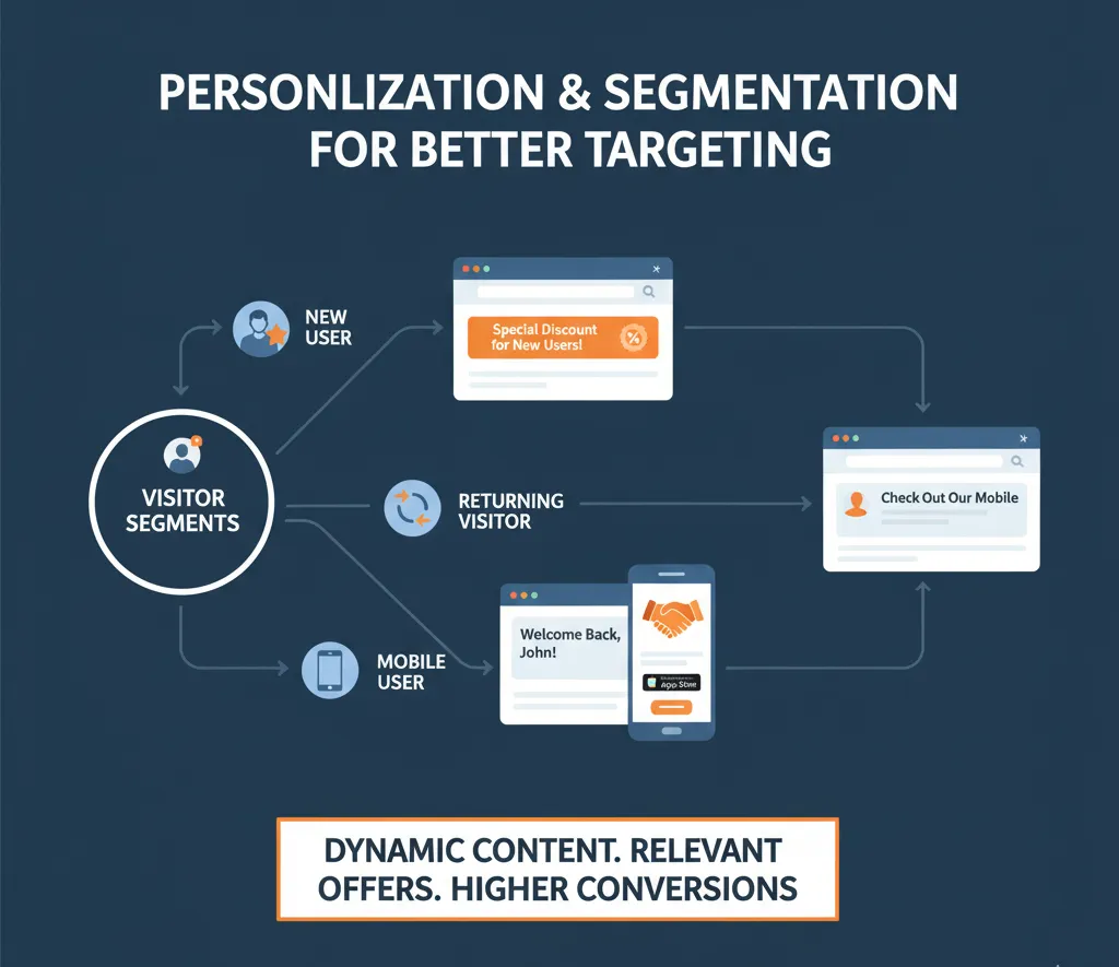
Smart Segmentation Strategies
Not all visitors are created equal. Some are ready to buy. Others just got here. A blanket message won’t convert both.
That’s why segmentation is key. It means breaking your audience into meaningful groups so you can tailor your content and offers.
Easy ways to segment:
- New vs. returning visitors
- Traffic source (Google, LinkedIn, Email)
- Device type (mobile vs. desktop)
- Geography
- Behavior (visited pricing page, watched demo, etc.)
Once you segment, you can customize:
- CTAs: “Book a Demo” for bottom-funnel visitors, “See How It Works” for top-funnel.
- Messaging: Use pain points relevant to the visitor’s stage.
- Offers: Give returning users a time-limited incentive or exclusive content.
Segmentation makes users feel seen—and that builds trust.
Behavior-Triggered Personalization
Go deeper by tailoring your site based on what users do—not just who they are.
Examples:
- If a user views the pricing page but doesn’t convert, show a demo invitation next time.
- If a visitor scrolls 75% down a product page, trigger a special offer popup.
- If a blog reader visits twice in a week, invite them to subscribe with a custom CTA.
Behavior-based personalization is powerful because it reflects real interest.
Tools to try:
- ConvertFlow
- RightMessage
- Segment
- HubSpot’s smart content
Keep it subtle. Don’t overwhelm users. One personalized message is often more powerful than 10 generic ones.
Personalized Follow-Up Campaigns
The conversion journey doesn’t end when someone leaves your site. In fact, that’s often when it begins.
That’s where personalized follow-ups come in:
- Retargeting ads: Show specific ads based on past behavior (e.g., visited cart but didn’t buy).
- Email nurturing: Send content tailored to the pages they viewed or actions they took.
- On-site return visits: Greet users with “Welcome back!” messaging or special offers.
Best practices:
- Use UTM tracking to link campaigns to behaviors
- Capture form data smartly (e.g., hidden fields for source)
- Be human—automated doesn’t mean robotic
Personalized follow-ups don’t just increase conversions. They increase loyalty, too.
Website Performance and Technical CRO Must-Haves
Improve Load Speed for Instant Gains
Site speed is one of the easiest—and most overlooked—ways to boost conversions instantly.
Did you know?
Just a 1-second delay in page load can drop conversions by 7%. For eCommerce, that’s the difference between profit and loss. Speed affects SEO, user experience, and trust—all major CRO factors.
Common culprits for slow speed:
- Large, uncompressed images
- Too many third-party scripts
- Outdated plugins
- Inefficient code
- Poor hosting
Quick speed-boosting tips:
- Compress images (use WebP or next-gen formats)
- Enable lazy loading for below-the-fold assets
- Minify JavaScript and CSS
- Use a CDN like Cloudflare
- Run tests on Google PageSpeed Insights or GTmetrix
Mobile speed matters even more. Most users won’t wait more than 3 seconds on a phone.
If you’re investing in traffic but haven’t optimized speed, you’re literally burning money. Fix this first—it’s the lowest-hanging fruit in CRO.
Mobile-Friendly Design and Core Web Vitals
Google now uses mobile-first indexing, and over 60% of web traffic is mobile. If your mobile site frustrates users, conversions tank—even if your desktop version is perfect.
Mobile CRO checklist:
- Large, tappable buttons
- Simplified menus and navigation
- Short forms with autofill
- Fast loading (especially for images and videos)
- No popups that cover the whole screen
Also, track and improve your Core Web Vitals, which Google uses to measure user experience:
- LCP (Largest Contentful Paint): Should be under 2.5 seconds
- FID (First Input Delay): Should be under 100ms
- CLS (Cumulative Layout Shift): Should be less than 0.1
Improving these metrics increases both conversions and SEO rankings. It’s a double win.
Building Trust with Technical Excellence
Your site may look great, but if it feels off—slow, broken links, insecure forms—people won’t trust it. And trust is the silent killer of conversions.
Build technical trust by:
- Using HTTPS (secure padlock in the browser)
- Fixing 404 errors and broken links
- Ensuring all forms work correctly
- Showing trust badges, certifications, or SSL logos
- Avoiding aggressive or deceptive popups
Also, make sure your checkout experience or lead form is frictionless—no surprise fees, no unnecessary steps, no clunky interfaces.
When your tech is tight, users feel safe. And safety is the foundation of action.
Tracking, Analytics, and Reporting for CRO
Setting Up Conversion Tracking
If you’re not tracking, you’re not optimizing—you’re just guessing.
Every high-performing CRO program starts with clear tracking.
Use:
- Google Analytics 4 (GA4)
- Google Tag Manager
- Looker Studio for dashboards
Track both:
- Macro conversions (purchases, form submissions, bookings)
- Micro conversions (button clicks, video views, page scrolls)
Set up goals in GA4, tag events in GTM, and monitor performance weekly.
UTM Parameters and Funnel Monitoring
UTMs are your best friend when it comes to attribution. Add them to links in:
- Email campaigns
- Paid ads
- Social media
- Partnerships
Example:
?utm_source=linkedin&utm_medium=cpc&utm_campaign=cro_offerThis helps you:
- Know where your best leads come from
- Spot weak-performing campaigns
- Report ROI accurately
Use funnel reports to analyze where users drop off. Focus on the biggest leak first—plug that hole and watch your conversions rise.
Reporting for Real Business Outcomes
Don’t just track for the sake of tracking. Align CRO metrics with business KPIs.
Report on:
- Conversion rate
- Cost per lead/acquisition
- Customer lifetime value (CLV)
- Campaign ROI
Use visuals—bar graphs, funnel charts, and heatmaps—so non-technical stakeholders get it at a glance.
CRO wins don’t just live in your dashboard—they should drive decisions across marketing, sales, and product.
Building a Culture of CRO
CRO as an Ongoing Growth Mindset
CRO is not a “project.” It’s a habit.
The most successful companies treat optimization like they do sales meetings or accounting—it’s on the calendar, regularly reviewed, and taken seriously.
Steps to build a CRO habit:
- Schedule monthly testing cycles
- Review test results as a team
- Always have 2–3 live tests running
- Document everything—what worked, what didn’t, and why
CRO isn’t about perfection. It’s about progress. Small wins stack up. Big wins start from those small tweaks.
Team Collaboration and Learning From Data
CRO isn’t just for marketers. Your whole team has valuable insights:
- Sales knows customer objections
- Support hears complaints
- Devs know where users struggle
- Product knows what features resonate
Create a CRO channel in Slack or Asana. Invite ideas. Share data. Celebrate wins.
The more brains you involve, the smarter your tests will be—and the faster you’ll grow.
Document Wins and Build a CRO Knowledge Base
Don’t repeat failed tests. Don’t forget your best-performing changes.
Create a central CRO log that includes:
- Test hypothesis
- Screenshots of variations
- Results and significance
- Learnings
Use tools like Notion, Airtable, or even a shared Google Sheet.
This log becomes your playbook. Over time, it tells the story of how your website evolved—and helps new team members get up to speed fast.
Conclusion
CRO isn’t about flashy tricks or one-time wins. It’s about understanding your users, testing relentlessly, and building a site that not only looks good—but actually performs.
When done right, CRO turns your website into a predictable, scalable growth engine.
You’ve now learned how to:
- Build a CRO foundation
- Improve design, speed, copy, and trust
- Run smart tests
- Personalize for every visitor
- Analyze, report, and improve continuously
Ready to turn your traffic into conversions? Contact us today and let’s map out your CRO roadmap together!
Want to shortcut the learning curve?
FAQs
1. What is a good conversion rate benchmark?
It depends on your industry, but a typical website conversion rate is 2–5%. Top performers can see 10% or more with proper CRO.
2. How long should I run A/B tests?
Until they reach statistical significance, which typically takes 2–4 weeks, depending on traffic. Don’t end early—even if one version looks like it’s winning.
3. Can CRO help if I already have high traffic?
Absolutely. In fact, high-traffic websites benefit the most, since even a 1% improvement can lead to hundreds or thousands of extra conversions.
4. What CRO tools should I start with?
Start with Google Analytics 4, Hotjar, and Google Optimize (or VWO/Optimizely). These cover data, behavior, and testing.
5. Is CRO only for eCommerce?
Not at all. CRO is critical for SaaS, B2B, lead gen, local businesses, and more. Any site with goals can benefit from optimizing how users convert.

About Author
Nazmul HasanNazmul Hasan is a Dhaka-based SEO expert and AI search strategist with over eight years of experience scaling organic growth for global brands. Currently the Head of SEO at Notionhive, he bridges computer science with advanced LLM and generative engine optimization to drive sustainable, human-centric results for diverse industries.